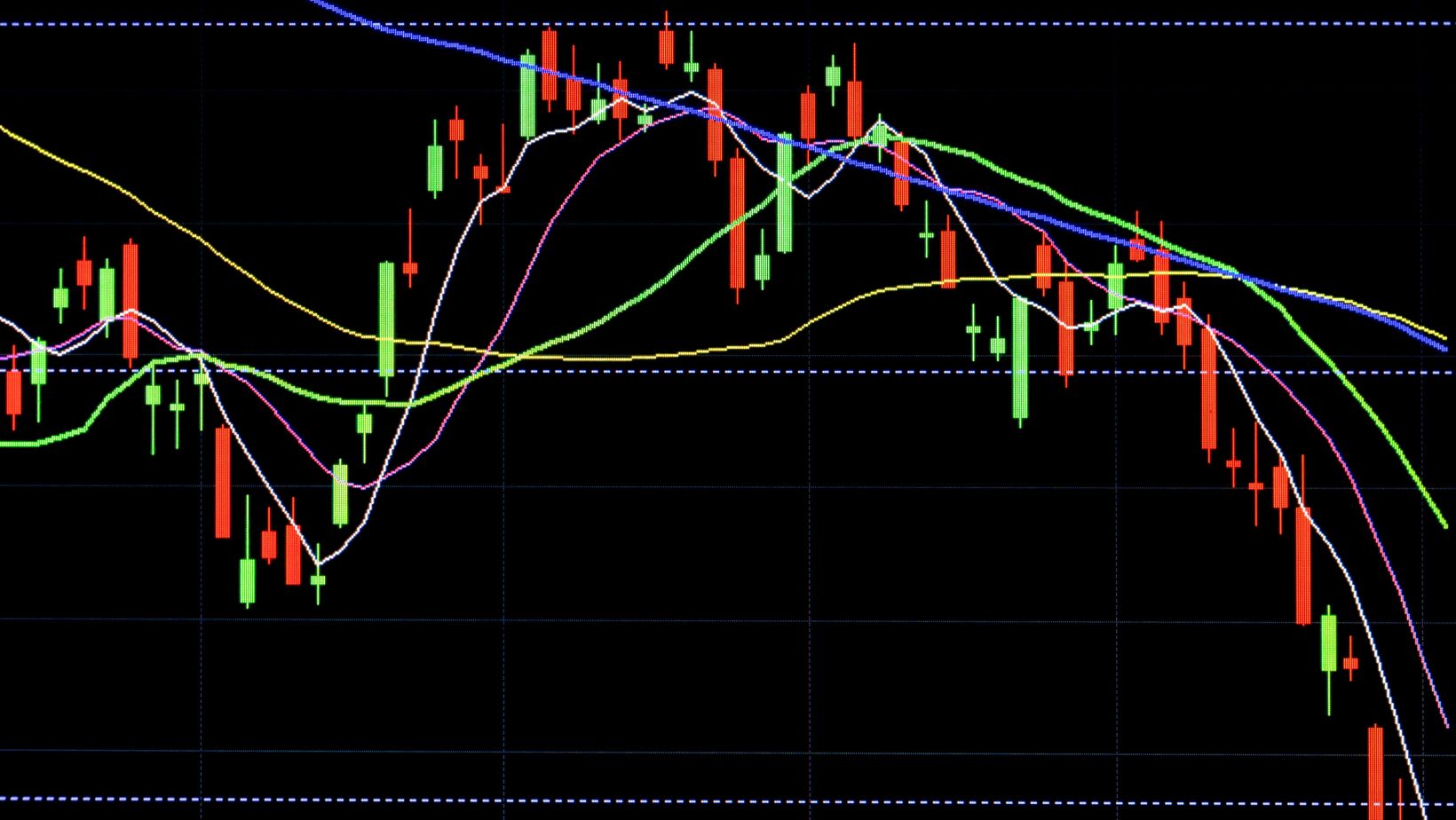
Navigating the intricate world of candlestick patterns is essential for anyone looking to decipher the language of financial charts with precision. As a trader or investor, understanding this visual representation of market data can provide valuable insights into price movements and potential future trends.
This comprehensive guide will introduce you to the basics of candlestick charts and provide tips for interpreting them.
What are Candlestick Charts?
A candlestick chart is a type of financial chart that displays the high, low, open, and closing prices for a specific period. Each candle’s body represents the range between the opening and closing prices, while the wicks or shadows show how high and low the price moved during that time.
Candlestick charts originated in Japan in the 18th century and were primarily used to track rice prices. They gained popularity in the Western world after being introduced by financial expert Steve Nison in the 1990s.
6 Tips for Reading Candlestick Charts
Below are some tips to help you interpret candlestick charts and use them effectively in your digital assets trading decisions.
Understand Basic Candlestick Structure
A candlestick consists of a body (the wide part) and wicks (the thin lines above and below the body) representing the price extremes.
Green or white candles indicate that the closing price was higher than the opening, suggesting bullish conditions. Red or black candles suggest bearish conditions, with the closing price lower than the opening.
For leveraged ETFs, it is important to note that the prices shown on the chart may not always align with the actual price of the ETF due to compounding and tracking errors. Therefore, using other indicators and analysis techniques in conjunction with candlestick charts is essential for more accurate decision-making.
Pay Attention to Candlestick Patterns
Candlestick charts can show various patterns that can help identify potential market trends or reversals. Some common patterns include:

- Doji: A pattern where the opening and closing prices are virtually equal, indicating indecision among traders.
- Hammer and Hanging Man: Both are characterized by a small body and a long lower wick. Hammers occur at the bottom of a downtrend, signaling a potential upward reversal. Hanging Man patterns are at the top of an uptrend, suggesting a possible downward reversal.
- Bullish Engulfing and Bearish Engulfing: These patterns involve two candlesticks. A Bullish Engulfing pattern occurs when a small red/black candle is followed by a large green/white candle, indicating a potential shift from a bearish to a bullish market. A Bearish Engulfing pattern is seen when a small green/white candle is followed by a large red/black candle, pointing towards a possible shift from bullish to bearish conditions.
- Shooting Star and Inverted Hammer: The Shooting Star is identified by a short body at the lower end and a long upper wick. It occurs at the peak of an uptrend, signaling a potential reversal to a downtrend. An Inverted Hammer also has a long upper wick with a short body, but it appears during a downtrend, suggesting a potential upward reversal.
- Morning Star and Evening Star: The Morning Star pattern indicates a shift from bearish to bullish conditions and is composed of a short body candle between a long red/black and a long green/white candle. The Evening Star pattern suggests a shift from bullish to bearish conditions, with its arrangement being the mirror opposite of the Morning Star, signaling the end of an uptrend.
Combine Candlestick Patterns for More Accurate Signals
Combining the above candlestick patterns can increase their reliability and accuracy. For example, you can look for a bullish engulfing pattern and a hammer or doji candle to confirm a potential trend reversal.
Similarly, combining bearish patterns like dark cloud cover with an evening star formation can strengthen the possibility of a market downturn.
However, it’s essential to note that not all combinations of patterns will result in accurate signals. Before making trading decisions based on combined candlestick patterns, it’s crucial to consider the context, market conditions, and other technical indicators.
Analyze the Context of Patterns
Understanding the broader market context is crucial. A bullish pattern during an overall downtrend might be less reliable. Similarly, candlestick patterns should be interpreted considering the prevailing market conditions and other technical indicators.
Lack of confirmation from other indicators can also weaken the strength of a pattern and should be taken into account.
Use strategies such as trend analysis, support, resistance levels, and volume analysis to assess the context of a candlestick pattern. This will help you determine its potential strength and reliability.
Practice with Different Time Frames
The timeframe of the candlestick chart can significantly impact your interpretation. Shorter timeframes might show more noise, while longer periods can provide a clearer view of the market trends. Practicing on different timeframes can help you understand how candlestick patterns might vary with the period selected.
The best approach is to analyze market trends on multiple timeframes, starting with higher ones like weekly and daily charts and then moving down to shorter periods such as hourly or 15-minute charts. This will provide a more comprehensive understanding of the market and help you identify potential trading opportunities.


