Ever wonder why some online shops make browsing and buying so easy? It all comes down to well-crafted product pages. These are more than just a spot for images and prices; they’re the heartbeat of any e-commerce store.
In this article, we’ll unpack what makes a product page tick and why it’s crucial for online shopping success. Whether you’re a business owner seeking to boost sales or a savvy shopper curious about what’s behind your seamless experiences, you’ll find insights that match your needs.
What are Product Pages?
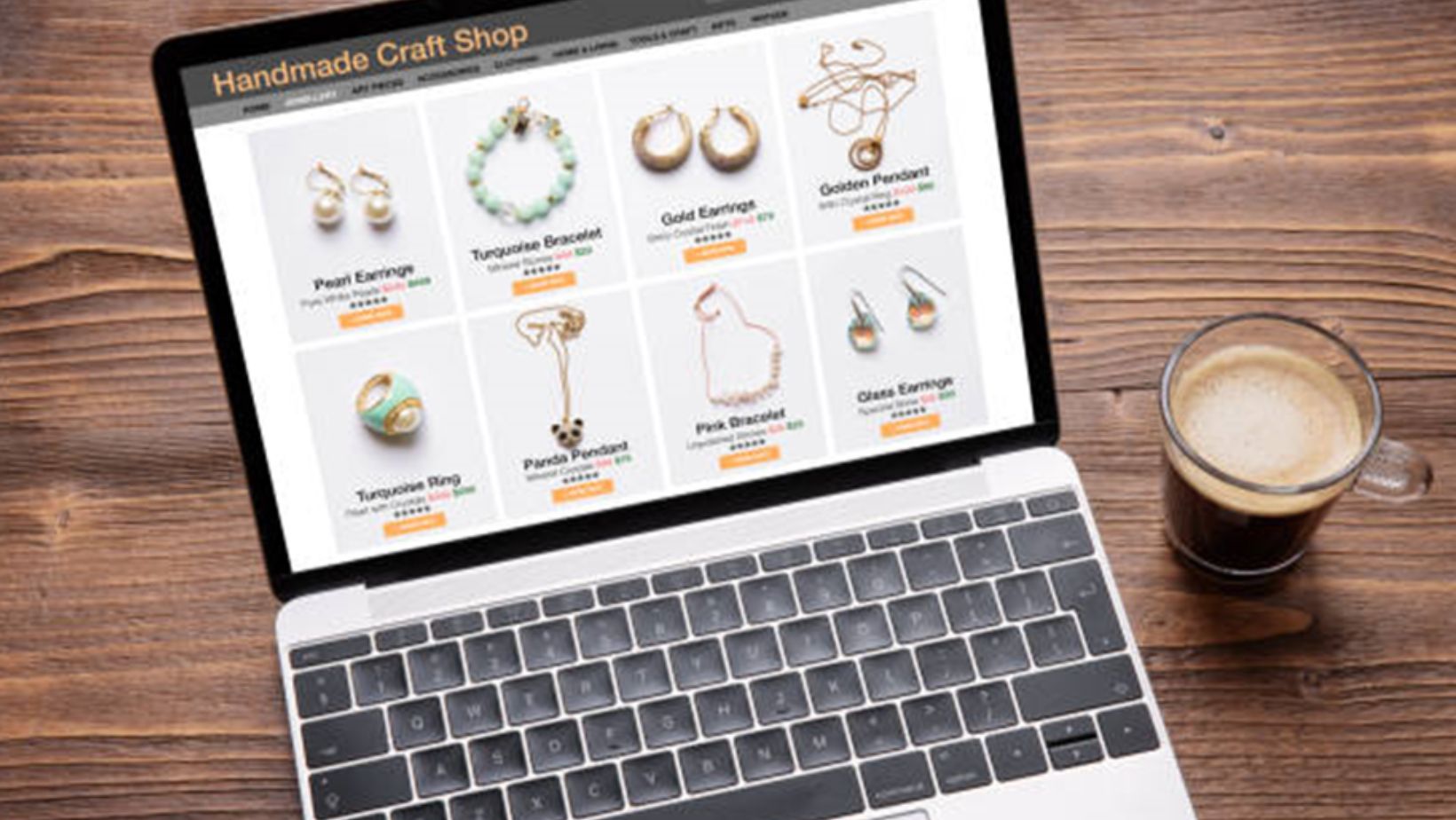
A product page (see more here) is where shoppers land when they click on an item they’re interested in. It’s the digital equivalent of a store shelf, showcasing everything they need to know about a product. From eye-catching images to detailed descriptions, product pages play a critical role in driving sales and building trust with customers. Let’s break down these pages to see what they’re made of and what they do.
The Components
A well-designed product page comprises several key components that together create a comprehensive shopping experience. Here’s what you’ll typically find:
- Product Images: These are more than pictures; they’re a product’s first impression. High-resolution images (preferably from multiple angles) catch the eye and help customers visualize the product in their life. Quality here counts – blurry images can quickly deter potential buyers.
- Product Descriptions: This is where words work their magic, painting a picture and detailing what static images can’t. A good description includes size, color options, materials, and practical use. It’s about telling a story that makes the product irresistible.
- Pricing: Clear, upfront pricing is non-negotiable. Customers need to know what they’ll pay, and hidden costs are a deal-breaker. Many pages also include discounts or promotions right next to the price to tempt shoppers further.
- Customer Reviews: Testimonials from fellow shoppers can boost credibility and provide real-world insights into a product’s functionality. They can be as engaging as they are informative, often influencing purchasing decisions more than the brand’s copy.
Purpose and Functionality
The primary purpose of a product page is simple: to convert visitors into buyers. It serves as a hub of information, guiding customers through their purchasing journey. But how does it function in this process? It showcases the product, answers questions before they’re asked, and provides reassurance through reviews and testimonials. This silent assistance makes shopping convenient and confidence-boosting, ensuring fewer hesitations at checkout.
Product pages also play a crucial role in enhancing search engine visibility. By incorporating keywords and structured data, they help products appear in relevant searches, drawing in more potential customers. So, when you hear that product pages are vital in e-commerce, it’s not an exaggeration. They are essential in both the buyer’s journey and in attracting traffic in the first place.
In short, product pages aren’t just part of the shopping experience—they are the shopping experience. Without them, online stores wouldn’t function half as efficiently or effectively.
Key Elements of a Product Page
You can learn more from sites like Clickfunnels, which have information about product pages
A great product page doesn’t just happen. It’s carefully crafted with several key elements in mind:
1. High-Quality Images
Images are crucial. They give consumers a closer look at what they’re buying. Clear, high-resolution images from multiple angles make products feel real. Consider this your chance to showcase every detail that can’t be conveyed through text alone.
2. Detailed Descriptions
Ever read a product description and still felt confused? A good product description balances creativity and clarity. It not only describes features but also explains how they benefit the user. Think about it from the buyer’s perspective: What do they need to know before hitting “Add to Cart”?
3. Pricing Information
Let’s face it, pricing can be a dealbreaker. Display prices prominently and transparently. Include any available offers, discounts, or allow the buyer to choose different variants, such as size or color, and see how it affects the price.
4. Calls to Action (CTAs)
A call to action is the final nudge a potential buyer needs. Use active language like “Buy Now” or “Get Yours Today” to create a sense of urgency. Ensure that CTAs are easy to find and even easier to click.
5. Customer Analysis
Nothing beats word-of-mouth. Customer reviews provide social proof, building trust and confidence in skeptical buyers. Most shoppers read reviews before purchasing, so highlight these prominently.
Smooth navigation leads to a better user experience. Enable features like breadcrumb links, filter options, and search bars. These help users find what they need quickly without feeling lost.
Enhancing User Experience
While the above elements are essential, there are more ways to enhance the user’s experience on a product page:
Mobile Optimization
Your audience isn’t just sitting at desktops anymore. Many shoppers browse from their phones. If your pages aren’t mobile-friendly, you’re losing business. Ensure images load fast, texts are readable, and buttons are easy to tap.
SEO Practices
Get found. Product pages should be optimized for search engines. Use relevant keywords in titles, descriptions, and metadata. Think about what queries your potential shoppers might type into Google.
User Feedback
Listen to your users. They provide insight into the real-world experience of navigating your product pages. Use this input to continuously refine the experience. After all, satisfied customers are likely to return.
Common Mistakes to Avoid
Overwhelming Information
Too much text or too many images can be a turn-off. Keep it concise and relevant. Focus on what really matters to your potential buyer.
Neglecting Updates
Your product offerings, prices, and descriptions change over time.
Ensure these updates are reflected immediately on your site to avoid discrepancies that can break trust.
Ignoring Loading Times
Slow load times can send potential buyers running. Optimize your site speed. Use compressed images and simple design elements to ensure your pages don’t lag.
Conclusion
Product pages are the heart of e-commerce. They’re the bridge between curiosity and purchase. Crafting an effective product page involves balancing aesthetics with functionality. With high-quality images, clear descriptions, transparent pricing, and a focus on user experience, you can convert more visitors into loyal customers.


